I was going to write this article with ChatGPT and try to rank for one of the SEO Keywords, but fuck it, i'll just make it into a self-referential, meta-shitpost and rant instead.
Let's be honest, a lot of admin panels and website templates suck.
Why most of them suck
-
Overuse of animations: If your animations and fancy "fade up from transparent" bullshit last for more than 200ms and moves more than 15 pixels, you are bad and should feel bad, there, i said it. Next
-
"Too Webflow-y" or as a normal person would describe it; over reliance on good looking images: Look the reason for me seeking out templates in the first place, is that i don't have fancy images or unique design elements to use, that is why when i see templates that, after you've bought it and you dig into it, find that everything you liked about the temaplte, was soly due to the images being specifically crafted to look good on that page.
-
Vue/React/Angular based: I mean, this is just a me-thing, but I don't usually use a frontend-framework, I use the almightly Laravel with Blade and Livewire, meaning i need PURE HMTL templates that i can copy paste into my Blade file, then split into blade components, partials and includes (i mix components and partials because it conveys "this can be reused", and "i just want to put this in a seperate file to not have to look at 500 lines of html")
-
Unpractical layouts/"Too creative": Just, Stahp. Nobody other than creative design agencies with monochromatic colorpalettes and UPPERCASED HELVETICA TEXT likes that bullshit, I build applications and websites for normal human beings, let's keep the navbar, hero, 3 blurb boxes and alternating image-text blocks mkay? People keep using that layout for a reason, it works with everything.
So here is a list of templates that don't suck.
Listicle: Start
Tabler (Bootstrap 5)
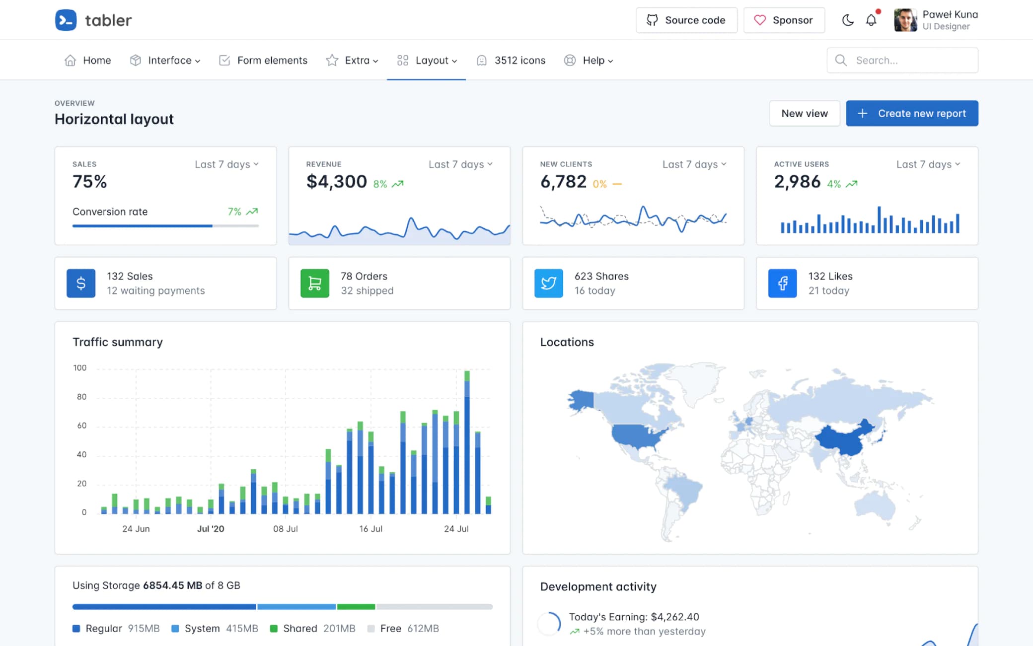
Clean, modern, usable; It's easy to change the blue color to another color that matches whatever brand you're building something for
It's neat.
I like it, and will most likely use it in the future, even though it's Bootstrap, and we all collectively stopped using it and went drooling after the rebelious Tailwind CSS instead (no shade, I love Tailwind too 🤗).
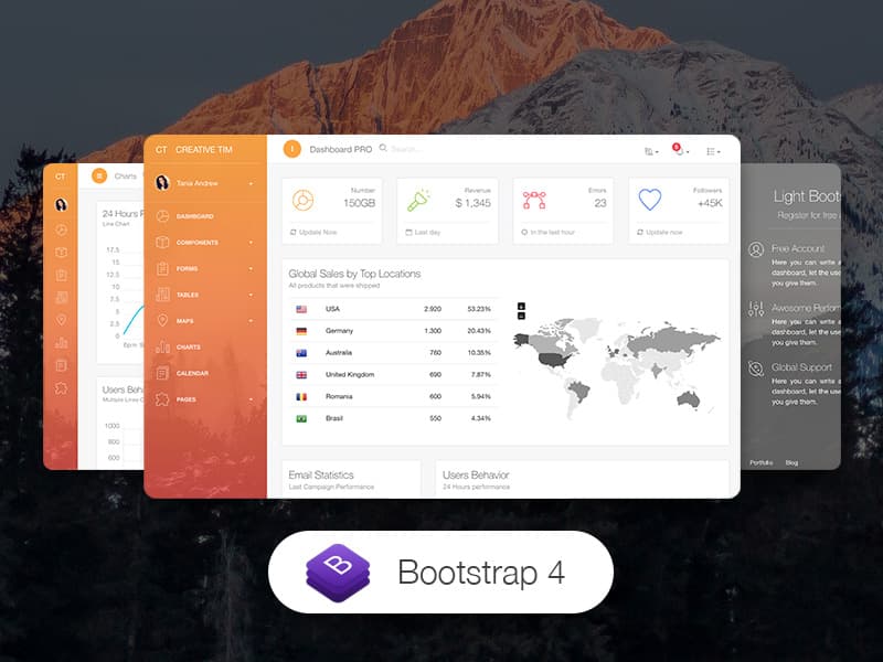
Light Bootstrap Dashboard Pro (Bootstrap 4)
https://www.creative-tim.com/product/light-bootstrap-dashboard-pro
Oldie but goodie, it's uncomplicated, has some nice gradients, but without going too overboard, I'll probably never use it again, since its Bootstrap 4 and Tabler.io exists, but I remember this one fondly.
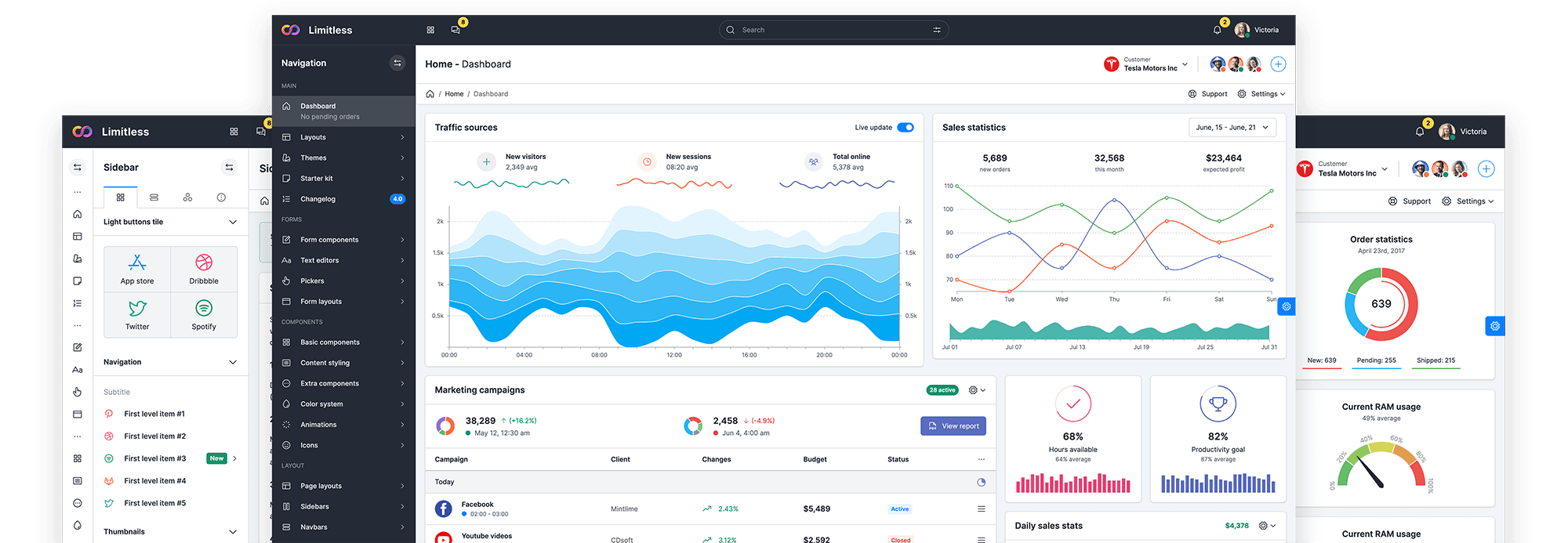
Limitless - Responsive Web Application Kit (Bootstrap 5)
https://themeforest.net/item/limitless-responsive-web-application-kit/13080328
Truly "Limitless", this is one of the first HTML tempaltes I bought from Themeforest back in the day.
Its packed full of stuff, which can be daunting, since you have to strip away a lot of it to start working with it.
But if you need a lot of options (because you are building something complicated), this one is a pretty good choice.
Tailwind UI, Of course...
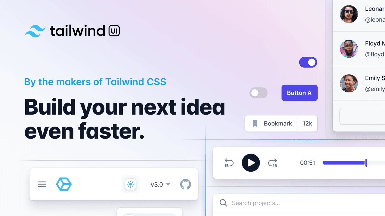
Most of you probably already know about it, but for the sake of the listicle, I listed it.
Built most of my side-projects using only Tailwind UI, if you're creative with it, it can take you far.
Tailwind UI Kit (IT'S DIFFERENT, it has "Kit" at the end)
https://tailwinduikit.com/templates
Real-world layouts that you can actually use in a side/client-project. Component-oriented, just like Tailwind UI, meaning you can copy-paste the bits you need.
Flowbite (Blocks specifically, also Tailwind)
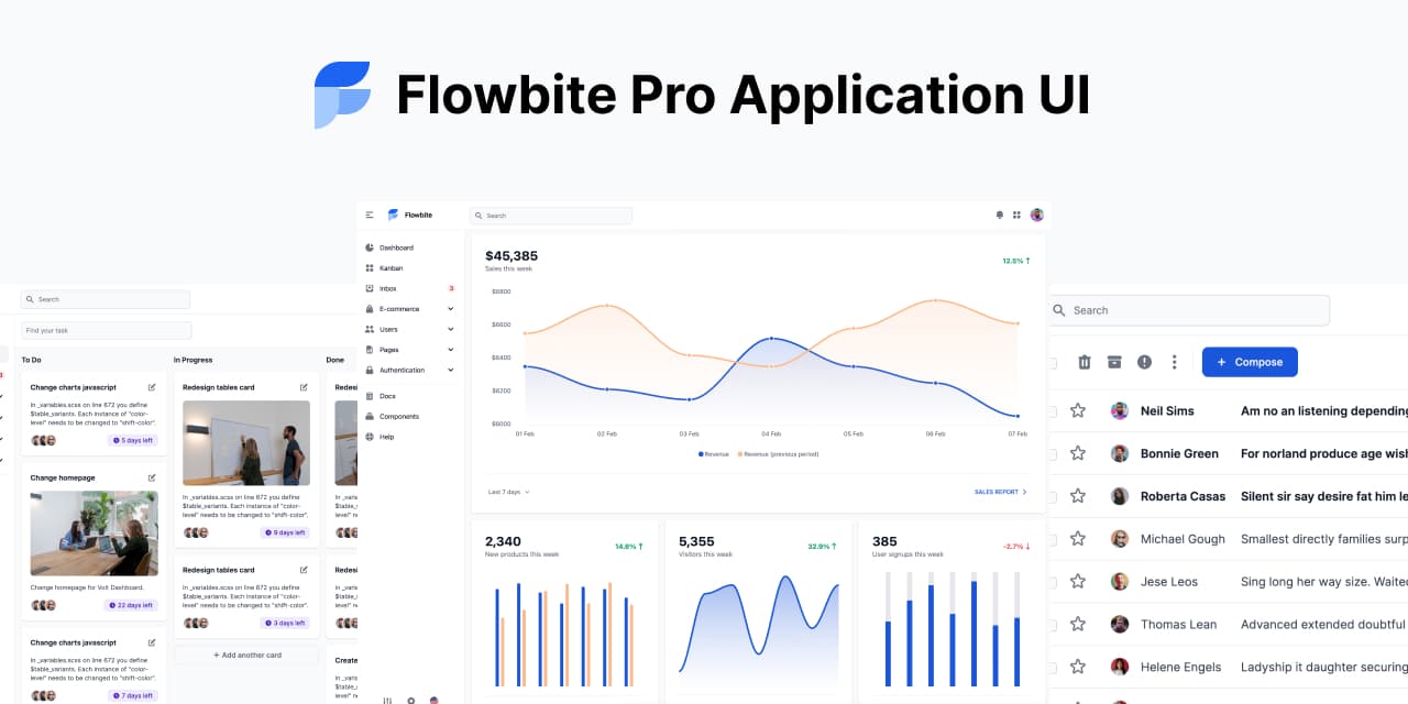
Same as Tailwind UI Kit, but less stylized, works well for a marketing page that you slap some color on, or use it for whatever SaaS project you are working on that needs a decent UI.
The Blocks (which are block-componets ou copy paste) looks very useable, I approve.
Cruip (Tailwind)
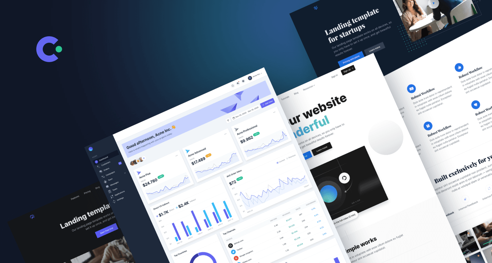
Cruip, which has an affiliate program, offers some highly interesting templates. They have dedicated templates for job portals, communities, documentation, and general "startup landing page" designs. All of these templates appear to be of high quality. Personally, I'm not a big fan of the "blue gradients" because they can make it difficult to adapt to a specific brand. However, you can easily replace those gradients with a solid background color or an off-gray/white shade to make it more suitable.
Their "admin panel" template called Mosaic is my favorite, looks very clean and usable, good stuff all around!
Bonus: Lexington Themes
Multiple themes bundled into this one, but they all look quite good, and you could actually use them in a real project, unlike half of the damn Webflow templates.
I mean, seriously, who even designs those things? Art students who just discovered brutalism and decided to combine it with the Dropbox brand colors? Ugh, no!
Give me black, white and, a brand color and sensible layouts, please!
These templates are designed and built by Michael Andreuzza, and are made with Astro and Tailwind, which might be a dealbreaker for some, but it shouldn't be that much of a pain in the ass to rip out the HTML from the Astro and use it in your own Vue project or whatever, and the Michael follows me on Twitter and makes good stuff, so he gets a pass.
Bonus2: Icon Packs
But wait, there's more!
You need icons, but you suck at making them, so you try to search on google, and end up on freeiconpicker.biz/whatever, you click on "download", and now you have to signup and suddnetly it costs money!
Boooooooh!
Let's get you hook up with some REAL icons.
Tabler Icons
Used in the Tabler.io template, they look nice, and it even includes a car icon!
Heroicons
Meet the heroes of the icon world—Heroicons (). With their impeccable clarity and simplicity, these beautifully crafted icons are ready to save the day. While they may not have the largest library of icons, Heroicons excel in providing commonly used icons with exceptional quality. From user interfaces to navigation elements, Heroicons deliver a visually pleasing and consistent icon pack that will elevate your projects.
Font Awesome
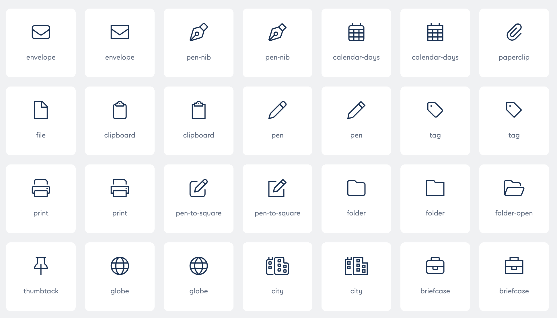
The OG, safe choice, buy the Pro licence and use the "light" variants so you don't look like you just used the free package.
Done
Listicle: end
